Recently, I worked on the newsletter sign-up form for this website. When I looked at examples, I saw that other developers used pseudo-classes :active, :focus :focus-visible to style form fields.
My handle on these pseudo-classes could have been better, and I decided to read up on their
specifications. In this post, I share my learnings. You can follow along with the StackBlitz
workspace below. It also runs on mobile devices, but you should run it in a desktop browser to get
the most out of this post. For instance, pseudo-class :active does not affect touch devices,
and the first example will make no sense.
I took the screenshots in this post with Google Chrome. What you see in your browser may be different. There are subtle cross-browser differences for the pseudo-classes covered in this post.
Pseudo-class :active
A browser applies :active when a user activates an element. Activation refers to the timespan
between clicking an element and releasing the mouse button. :active can be applied to
elements with which users interact, e.g., <a>, <button>, <input>:, <select>, and <textarea>.
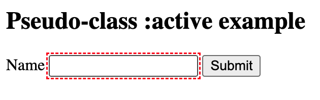
In the first example we look at :active. I applied :active to the input element
and submit button with the following styles:
When you click the input field, you can see a dashed red outline until you release the mouse button:
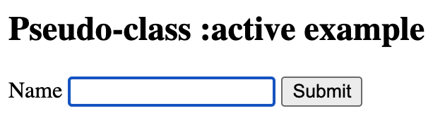
When you release the mouse button, the input field has focus. The browser draws a default outline around it to highlight its focus:
While you click the submit button, you can see the dashed red outline until you release it:
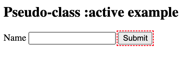
The takeaway from this example is that :active styles are in effect while you press the
mouse button until you release it.
Pseudo-class :focus
A browser applies :focus when the activation is complete, and an element is ready for
user interaction. There are different ways of giving focus to an element. You can click or tap the
element or use keyboard navigation with the
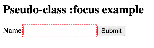
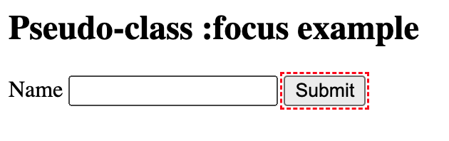
In the second example, we look at :focus. I applied :focus to the input element
and submit button with the same styles as before:
You can see the dashed red outline again when you click the input field. But this time, it stays until the input field loses focus:
Likewise, when you click the submit button, you can see the dashed outline until it loses focus:
Instead of clicking the input field and submit button, you can use the
The takeaway from this example is that :focus styles are applied when an element has focus,
and it does not matter whether a click, tap, or the
Pseudo-class :focus-visible
:focus-visible can only be applied when an element has focus. But a browser can decide
whether or not to apply :focus-visible to an element with focus. Browsers use a heuristic
to determine whether they apply :focus-visible to a focused element.
In the third example, we look at :focus-visible. I applied :focus-visible to the input element and submit button with the same styles as in the previous
examples:
When you click the input field, you can see the dashed red outline again when the input field has focus:
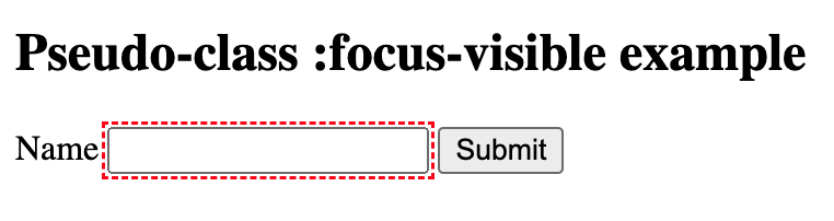
For the input field, there is no difference between :focus and :focus-visible. But when you click the submit button, the dashed red outline is not
visible:
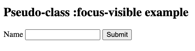
But when you use the
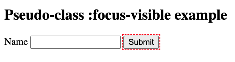
In this case, the browser decided against applying :focus-visible to an element with focus.
And it makes sense. Once the input field is focused, the user must type in some information, and the
styles applied with :focus-visible emphasize this expectation.
The submit button is a different story. After a user clicks the button, no other interaction is
required; thus, the browser does not apply :focus-visible. For most common use cases
you will encounter as a developer, it makes sense to use the :focus-visible pseudo-class instead of :focus.